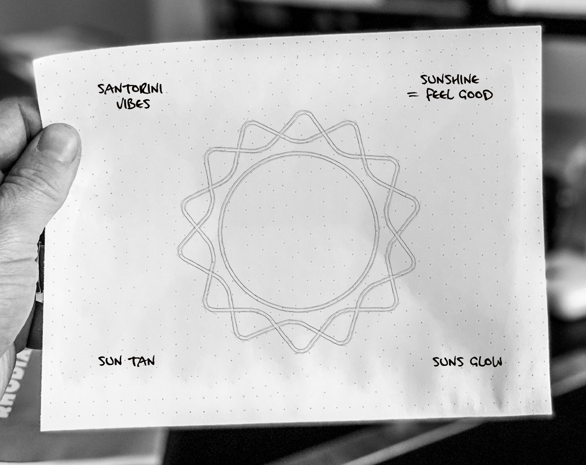
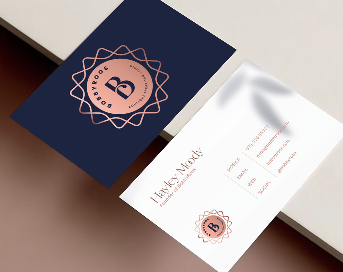
We collaborated with the startup Bobbyroos to develop a distinctive identity for Hayley’s tanning business. Drawing inspiration from the sunny vibes of Santorini—a place of personal significance to Hayley—we aimed to create a logo that resonates with her target audience and evokes feelings of relaxation and warmth.
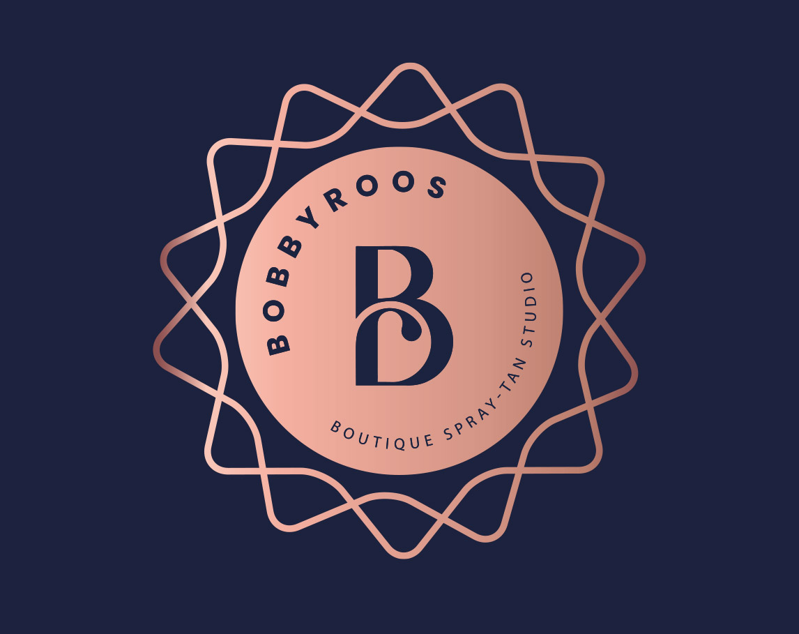
The logo design combines a stylised sun motif with a unique “B” icon, forming a clever and bespoke logo mark. The accompanying logotype is versatile, designed to adapt seamlessly across various applications. The colour palette is rooted in Santorini blue, complemented by fresh, natural tones that reflect skin tones and neutral shades for balance.
The brand revolves around the radiant essence of sunshine, with a sun-pattern graphic adding a subtle glow and texture that enhances the overall identity. This thoughtful design approach ensures the brand feels fresh, inviting, and perfectly aligned with its sunny inspiration.
BOBBYROOS
Glowing from within.
The result is a cohesive, approachable brand that reflects Hayley’s vision and helps the business stand out in a competitive tanning market.
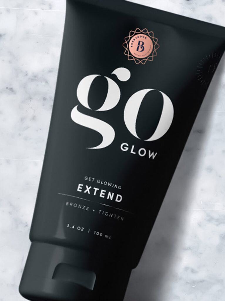
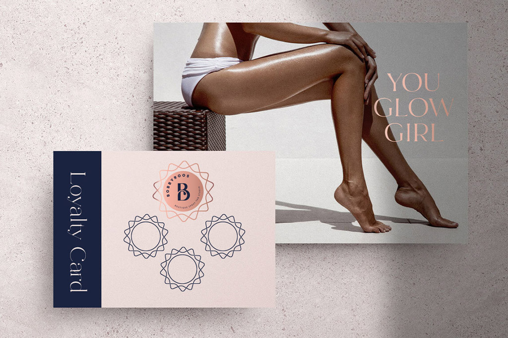
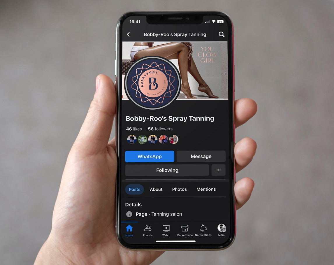
Beyond the logo, the identity includes a sun-pattern graphic delivering subtle glow and texture—perfect for evoking warmth and depth in visual assets. The brand is fully adaptable across print, digital, merchandise, and physical branding—ensuring consistency and flexibility.
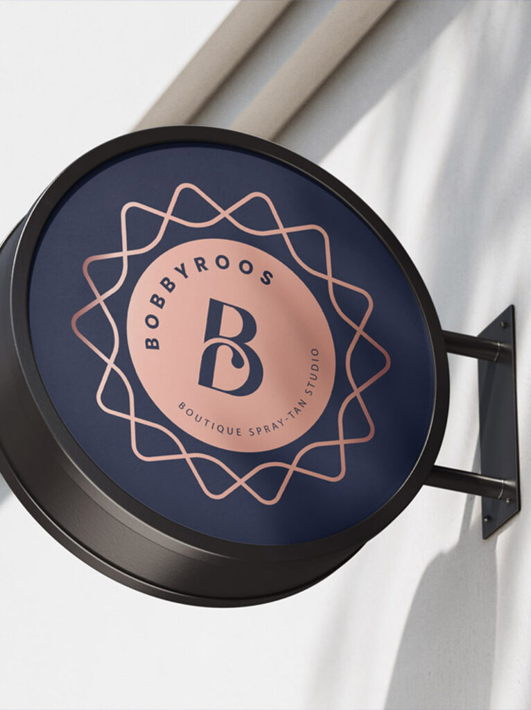
The identity blends charming visual appeal with a refined, professional edge—helping Bobbyroos stand out in a crowded tanning market. The Santorini-inspired palette and sun motif create warmth and positivity, aligning with the service’s sun-kissed promise.
“In the Middle have completely transformed my business. From the stationary to my social media strategy, they have given me a professional look that really represents my brand. Paul and the team have tailored solutions that have really had a massive impact on my business. Working with them have been a real game changer.”
Hayley, Bobbyroos Spray Tan